Founded in 2004, U Hemisferios is an Ecuadorian Institution with a profound human vision. It is recognized as an intellectual, guarantor and scientific promoter od the riches of our nation and its exceptional cultural, ethnic, geographic, biological and humanistic diversity. We simplified the name, added a slogan, changed the strategy and designed a new image that better conveys what the university represents: innovation and humanism. The result is an academic graphic with a warm tone that reflects and atmosphere of solidarity and friendly freedom.

Rebranding / Graphic Identity / Storytelling


The 3d elements that make up the graphic are segments abstracted from the logo. They are used in combination, in repetition, individually or separately. We like to provide our clients with personalized resources that make their communication extraordinary pieces.


Be part of something bigger.


U HEMISFERIOS
FEBRUARY 2021
Not That Store is an online store that promotes an eco friendly lifestyle. It’s visual components are based on statistical graphs in order to convey to the user, in a subtle way, the whole logistic and investigative process behind it. Not that Store is a platform that believes in a world that’s fair, clean and equal for everybody. Based upon scientific data, this is a brand that looks forward to connect with people that want to change their consumption habits in a friendly and direct way. It’s a meeting point where a difference can begin to be made.
Graphic Identity / Web UX & UI / Mobile App UX & UI / Storytelling


The pattern we created for Not That Store is made up geometric shapes that are used in statistics, to allude to the scientific and investigative background behind the brand. The way we use them however, is to create fun compositions where their meaning is not obvious. It’s a good metaphor for Not That Store: friendly front, hard data behind it.


We know it’s not easy, so we made it simple. So come on, let’s change the world, one habit at a time.


NOT THAT STORE
JULIO 2020

In this project, we used an editorial medium to call for respect, acceptance and equality. We covered a sensitive topic with tenderness and subtlety to engage readers to accept reality with the sweetness and ingenuity of a child.
Throughout this story, the author Maria Duran tells us with tenderness and simplicity how human relationships are built and the importance of seeing beyond our differences. Together with Make a Wish Southern Nevada and The Writers Block , at only 17 years old Maria published her first book and as a studio, we were the lucky ones to be part of this experience.

Book design / Illustration / Cover


Our process intends to give shape to Maria’s story through illustration. Creating images full of movement, intimacy and aesthetics. We try to portray the scenes with great detail in everyday objects, color and compositions. Creating magical spaces that in the story become a bridge for friendship to occur.

We believe that illustration is such a beautiful tool, not only for children but for everyone, old people and adults as well.


Several style proposals were made to define the aesthetics of the characters. These turned out to be expressive, with vivid tones and a magical atmosphere. We included fantasy elements so that the narrative feels like a playground and the scenery takes the readers mind for a fun ride. In each illustration we wanted to convey the inner world of a child and the spontaneous ability to imagine a dragon just by looking at a cat, or to make friends with another person in the blink of an eye. pictures.
Protecting their home is fundamental not only to their own survival, but to that of humanity.

Making coffee on an island is not easy.
But if there is one thing that Galapagos Islanders know, it’s to be resourceful, to listen to nature and learn from it. Islanders work with efficient technology, prioritizing sustainability to highlight the unique properties of volcanic-origin beans.
Behind each cup of coffee there are years of work, training, and a community that gives its best in each process: planting, harvesting, post-harvest and roasting.
This is not height altitude coffee… This is the evolution of coffee.

Graphic Identity / Packaging Design / Storytelling


Harvested and roasted with love in the Galapagos Islands.


We are inspired by the territory and the individual: each of these as a symbol of union and whole.


We developed a Galapagos graphic away from the iconic Darwin & Lonesome George to delve into another topic: the synergy that exists between human beings and the island. The archipelago leaves its mark on the individual who inhabits it, just as the islander builds and forges the archipelago in which he lives. Thus forming a coexistence where both are part of each other. Our logo, then, emerges as a symbol of union and togetherness.
We abstracted geometries and sensations from Galapagos to give Islanders a strong and dynamic identity: living on an island is the same as savoring a coffee, full of nuances and awakenings.


ISLANDER COFFEE ROASTERS
FEBRUARY 2022
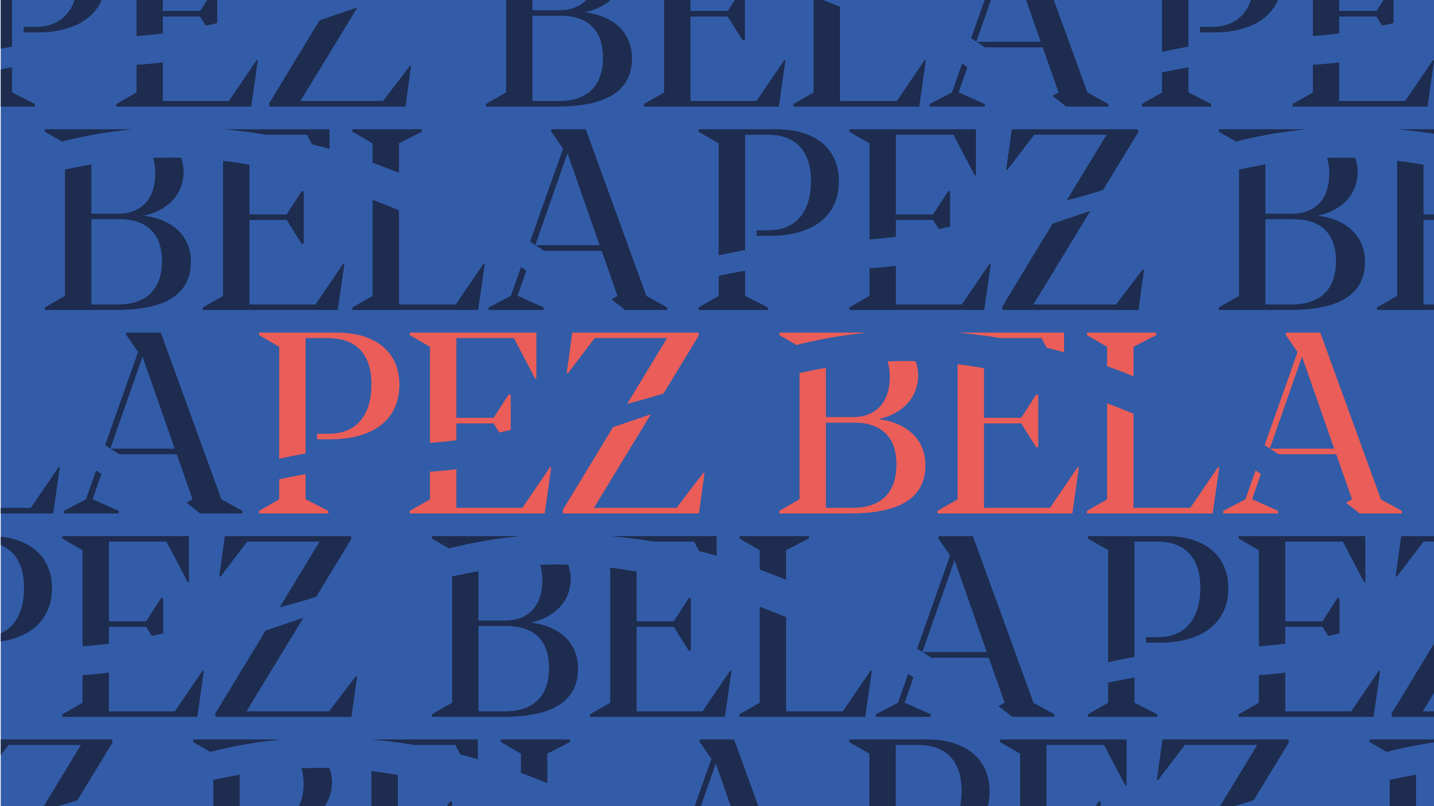
Meet Isabella’s cevicheria & Oyster bar. With an up and coming fresh proyect located in Gonzales Suarez neighborhood in Quito, Ecuador, Pez Bela has become one of the most exciting seafood restaurant in the city.
This is a space of reconnection, discovery and creation. A place for those in love with the sea, the mystery it harbors and the freshness found in its products.

Graphic Identity / Packaging Design / Storytelling

Reconection, origin and gratitude
Fishing and signature food are our central axis, which is why it was important that both, the name and the hook (a graphic allusion to fishing) be found in the brand’s logo. We created this union to convey a clear feeling from the first contact with the audience.
We chose a typeface keeping in mind the classic, elegant and romantic aspect of Pez Bela. It’s construction reminds us of the industrial and its finishes of fishing and kitchen elements.


Only by going back to the origin, we discover the soul of the ingredient


PEZ BELA
NOVEMBER 2021
Fábrega is a creative & dreamy brand runned by María José Fábrega, a designer and metalsmith born in Quito, Ecuador. Fabrega empowers women to express their authenticity through art and creation. We had the honor to develop an indentity that reinterpretates the beauty of the universe, through a modernist and aclectic aesthetic.
Graphic Identity / Packaging Design / Storytelling


We’re so exciting, we just can’t hide it


Without original creation, there is no growth of evolution.


For the logo, we designed a symmetric formula that synthesizes the initial of the brand over a geometric and simplified representation of a precious stone. We designed a ludic and imaginative pattern that was inspired in the jewlerry itsef. We combined organic ornaments with abstract gradients to modernize the pieces and take advantage of all of the digital formats.


FÁBREGA JEWLERRY
OCTOBER 2021
Secreto Sarayaku is a book by Ecuadorian photographer Misha Vallejo. In it, he documents the Kichwa people of Sarayaku, a community in the Ecuadorian Amazon, exploring how their worldview and technology mediate their relation to their habitat. According to Vallejo, the book is “a subjective photographic reinterpretation of the ancestral Kichwa knowledge of the Kawsak Sacha or Living Forest.”
Kawsak Sacha -or Living Forest- is an amazonian worldview that affirms the sentient spirit and interconnectedness of the jungle; everything is alive in the jungle, and what affects one, affects all. Accordingly, the Kichwa take from the jungle only what is necessary for survival. They also believe that they are assisted in the protection of their homes by beings known as Sacha Runakuna. But contrary to what most people think when they think about indigenous communities in the Amazon, Sarayaku is a place transformed by modernity. Today, the community uses technology such as the internet to educate their people, expand their message of wildlife and land conservation, and even post the occasional meme.
Book design / Illustration / Cover

Sarayaku is not linear. It resembles a circle with hundreds of nodes and internal connections.


What struck us most about the Sarayaku portrayed in Vallejo’s work is how influenced they are by the modern world. So, the mix between life in the jungle and technology became the core concept for the book design. For the cover, we hand-drew a school of catfish, which are ever-present in the book, digitalized and rendered them in 3D, surrounding the title as if they’re swimming around the letters. The color gradient is reminiscent of sunsets in the jungle, and very influenced by the colors of Vallejo’s pictures.
Vallejo showed us illustrations made by people in the community: a series of everyday animals and objects like monkeys, catfish, cellphones, and antennas. The illustrations were made using special pigments from Sarayaku, which Vallejo brought along and we used to play around, creating textures and shapes. As a secret touch, we translated the text in the book to binary code and hand wrote excerpts with the pigments, then added them to the book. To the naked eye, they resemble the face paintings and illustrations from the community, but it acts as a subtle nod on how the technology has crept into Sarayaku, influencing their communication and lifestyle.


Protecting their home is fundamental not only to their own survival, but to that of humanity.

Cooking is a metaphor for life. Anything can be explained with food analogies (or at least, everything should be to make it more interesting).
Take Bao Bao for example. Made with Mexican and Taiwanese ingredients, Bao Bao is crunchy-on-the-outside, fluffy-on the inside brand ready to be devoured by hungry eyes.

Brand Identity / Storytelling / Packaging

Inspired by Taiwan, made in Mexico.
Bao Bao is a Taiwanese eatery in Colonia Roma, the hot-spot for cool eateries in Mexico City.
They use Mexican ingredients to cook authentic Taiwanese cuisine. It is a place made for everyone, from locals searching for new flavors, to expats who crave meals from their home country. To create an atmosphere of nostalgia-meets-modernity, we took inspiration from old Taiwanese newspapers and handmade signs to build the graphic for the restaurant. We used naif illustrations to create a friendly set of characters that make up the world of Bao Bao. Aren’t they so cute you just want to eat them? Well, good thing you’re in a restaurant.

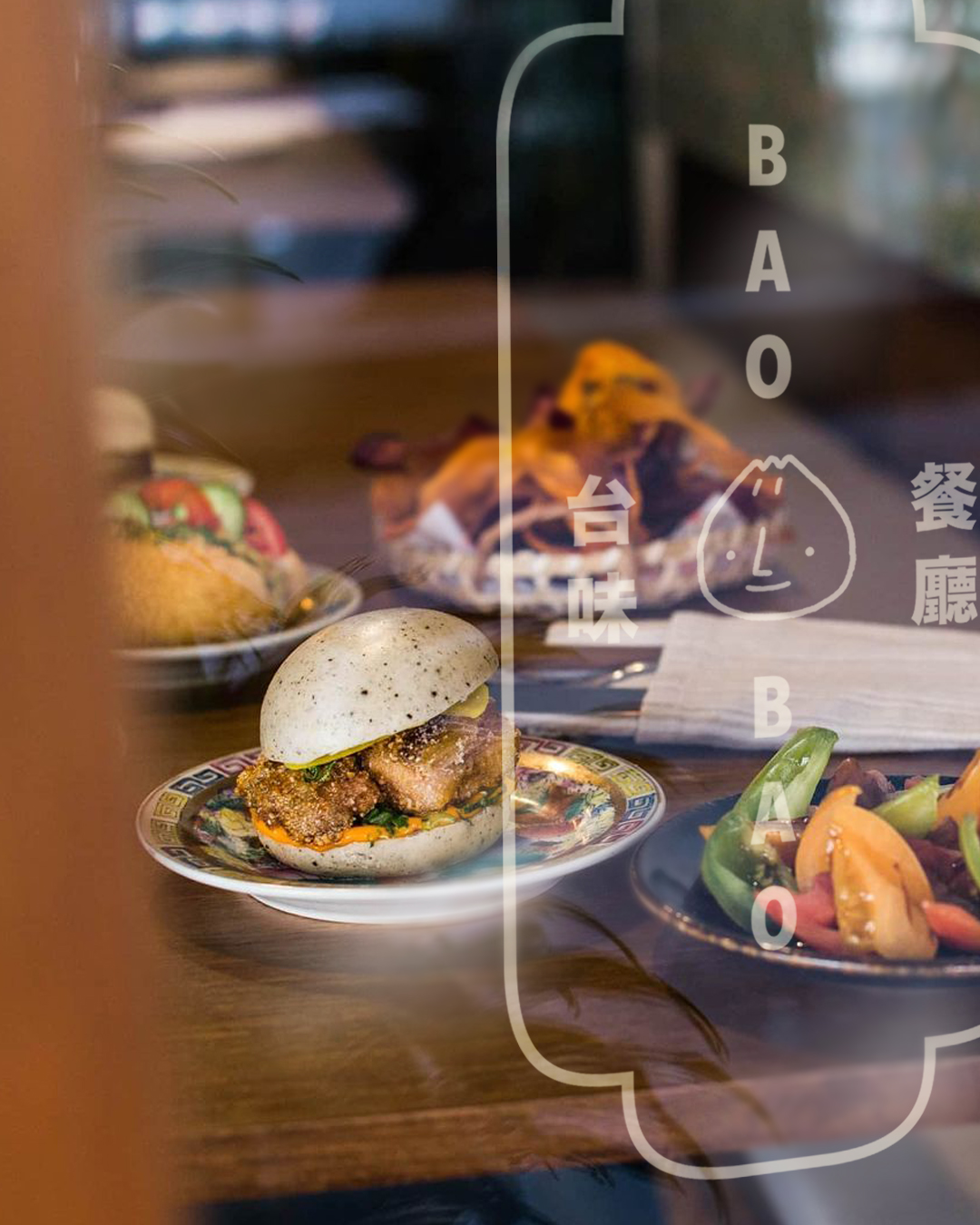
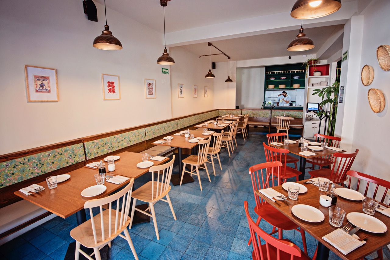
For a place with so much to say -they keep it real by using Spanish and Chinese for their communication- we used five different typographic families. This brand uses a lot of typographic compositions, so we wanted to give them lots of variety to keep creating. The main color palette was taken from the Mexican flag: red, green, and off-white. A simple combination to match the restaurant’s interior design. We got to build the branding before the opening of the restaurant, so there was constant communication with the client to see what could be done to the design that complemented the architecture, dish ideas, and merchandise. So, from menu design to packaging, we played around with the characters, typographic compositions, and colors, to build a fantastic Taiwanese corner in the heart of Mexico City.
Tenemos tanto que decir, que hasta hablamos en español y chino.


Fundación Futuro is a foundation created by Roque Sevilla’s Grupo Futuro, the largest insurance and tourism cluster of companies in Ecuador. It has been recognized as a progressive and innovative group of companies with a strong set of values, and with clear environmental and social aims at its core. Fundación Futuro’s purpose is to mitigate the effects of climate change, focusing their efforts on the conservation and sustainable management of the Andean Choco region.

Brand Identity / Applications
Transforming our footprint is now the purpuse.

We were born, we evolved, we walk towards the future.


When you’re in touch with nature, you’re in touch with yourself
At first glance, Fundación Futuro’s logo appears to be just concentric lines. Over time, hundreds of people have given us their impression of what it means to them: *topographical map lines”, “mountains”, “fingerprint”, “rings in the water”, and so on. Every time someone gives us a new meaning, we know we hit the nail on the head with what we wanted for the visual identity.
As a foundation with different approaches, it was important that the graphic identity be open enough to encompass different meanings without being generic or adhering to environmental conservation clichés. We moved away from symbols with leaves and planets, and went with rings to depict the environmental footprint and how our actions have an echo.
We created a logo by abstracting a fingerprint, which can be interpreted as the mountains and tree rings, to talk about the real impact we can have when when acting with environmental and social responsibility. From the logo, we developed matching patterns to use in the communication. Our goal was to give them an image that looks serious and corporate but modern and not too stiff. This visual identity can adapt to the growth of the foundation, and, as the rings do, expand with them in the future.
When someone finds something new in Fundación Futuro’s image, we know that the brand is growing.


Remu Apparel is a conscious clothing brand from Ecuador that makes garments built to last.
If there’s something Latin America is known for (apart from amazing food) is textiles. In Ecuador, knitting, weaving, embroidering, and other forms of textile production were once the main source of income for many families. When industrialization came, convenience replaced craftsmanship, jeopardizing the work and traditions of thousands of artisans around the country.
Remu started as a way to ensure traceability and justice in an industry (and world) that so desperately needed it. The clothes they make remind the public what it means to have a garment that will last so long that maybe your grandkids can inherit it. How many fashion companies in the modern world can say that?

Brand Identity / Storytelling

Know first who you are, then adorn yourself accordingly
For a brand where no two products are the same, we created a bespoke wordmark in collaboration with an Ecuadorian type artist. We wanted something simple and with a hand-made feeling to it, because even though Remu is a luxury brand, their core is unpretentious, homey, and warm.


We chose fonts to combine both the modern and traditional aspects of Remu. As a nod to all-time American brands, we played around with word compositions to build the brand’s storytelling.
The palette chosen for the brand is an ode to nature and things that age beautifully. Think about leather, wood, ceramic, denim… with proper care, these materials are made to last a lifetime, and the weathered effect they get throughout the years speak of their resilience and quality (not to mention how chic it makes them look!).

We want to highlight how nature and time bring out the best in things, what better way to do it than through its beautiful colors?


The pattern we created for Remu is an abstraction of starry nights in the Andes. And it has many uses! branded lining for garments, wrapping paper for packaging, wallpapers, etc. The sky’s the limit (and the theme here).
Finally, we developed a series of icons for the three pillars of the brand: upcycle, empower and explore. This is what Remu is all about. They aim to reach people who care about the planet, give opportunities who people to live in it, and encourage people to live a life of adventure. We added texture for a vintage vibe, continuing with the hand-made theme of the branding.

